
Decentralized Finance · Trading Protocol · Yield & Interest Rates
Making abstract financial primitives — PT, YT, maturity, implied APY, liquidity, and risk — understandable enough for users to act on.









Overview
Pendle is a decentralized finance protocol that turns future yield into a tradable asset — letting users separate, price, and trade the yield of an underlying token independently from its principal.
The complexity sits in the primitives. Principal Tokens (PT), Yield Tokens (YT), maturity dates, implied vs. underlying APY, liquidity depth, and the risk attached to each must all be legible at the moment of decision — or the product is unusable to anyone but quants.
System & Problem
Pendle splits any yield-bearing token in two: a Principal Token you redeem at maturity, and a Yield Token that captures the stream of yield until then. Both parts trade on an open market, so their prices imply a rate — the market’s live opinion on future yield. Users can lock in fixed yield, long or short future rates, or provide liquidity.
That same machinery is what made it intimidating: before committing capital, users had to hold several abstractions in their head at once and trust their own math.
Education
Pendle serves two kinds of users, and the design meets each on their own terms. For the sophisticated user who wants to understand the machinery before trusting it, I translated each concept into the UX itself — visual explainers that walk through the PT / YT split at the exact moment they meet it, so the interface teaches while it’s being used.
This is that first layer, as it ships today:
Yield tokenization, told step by step — the in-app guide I designed starts from a token the user already holds and walks to “you can trade its two halves,” one plain-language frame at a time.
Open the in-app guideGet Started, as it ships today — six entry points (fixed yield, leverage yield, limit orders, PT looping, points, LP), each with a difficulty rating, a one-glance diagram of the mechanic, the FAQ for that strategy, and a curated set of markets to act on — all on one screen, before the first trade.
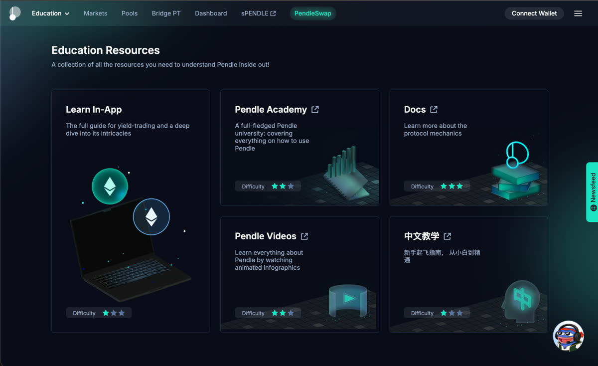
Open Get StartedGet Started covers the first trade. Not everyone learns at that moment, though — so the whole path beyond it is designed like a product rather than a pile of links: in-app explainers, docs, video, and Pendle Academy all sit behind one hub, organized by difficulty so users ramp at their own pace.
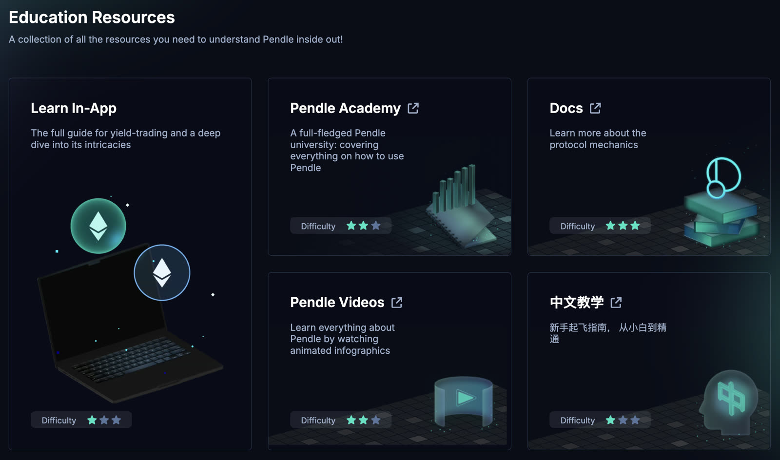
One front door to every depth of learning — the hub routes a curious user to a two-minute explainer and a serious one to Pendle Academy’s full beginner→advanced curriculum, without either feeling lost.
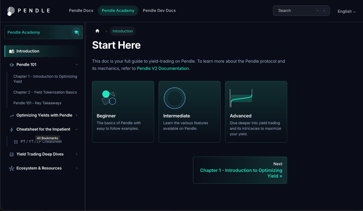
Go to the education hubAt the deep end sits the written reference. Pendle Academy turns the documentation into a curriculum — Beginner to Advanced — so the depth becomes a path someone can walk, not a wall of pages to search.
Three doors, sorted by who’s walking in — protocol docs for the mechanics, Academy for guided learning, and dev docs for integrators, so no one has to dig through the wrong one to find their answer.
Visit Pendle V2 DocumentationAbstraction
The other user doesn’t want a lesson — they want the outcome. For them, the complexity is folded away: routing, wrapping, and intermediate tokens collapse into a single action; smart defaults handle the machinery; advanced controls sit one layer deeper, out of the way until asked for.
The result: a trade that touches five contracts reads as one decision — and neither user is forced into the other’s experience.
Product Translation
I translated the protocol into flows, screens, and data visualization that let a user understand a position before they take it — turning math into a decision they can read at a glance.
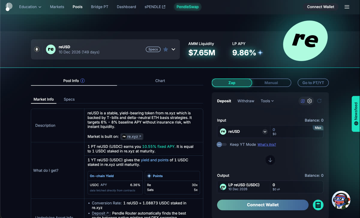
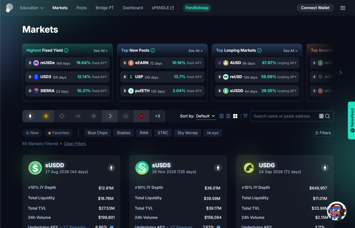
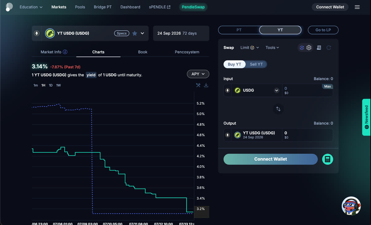
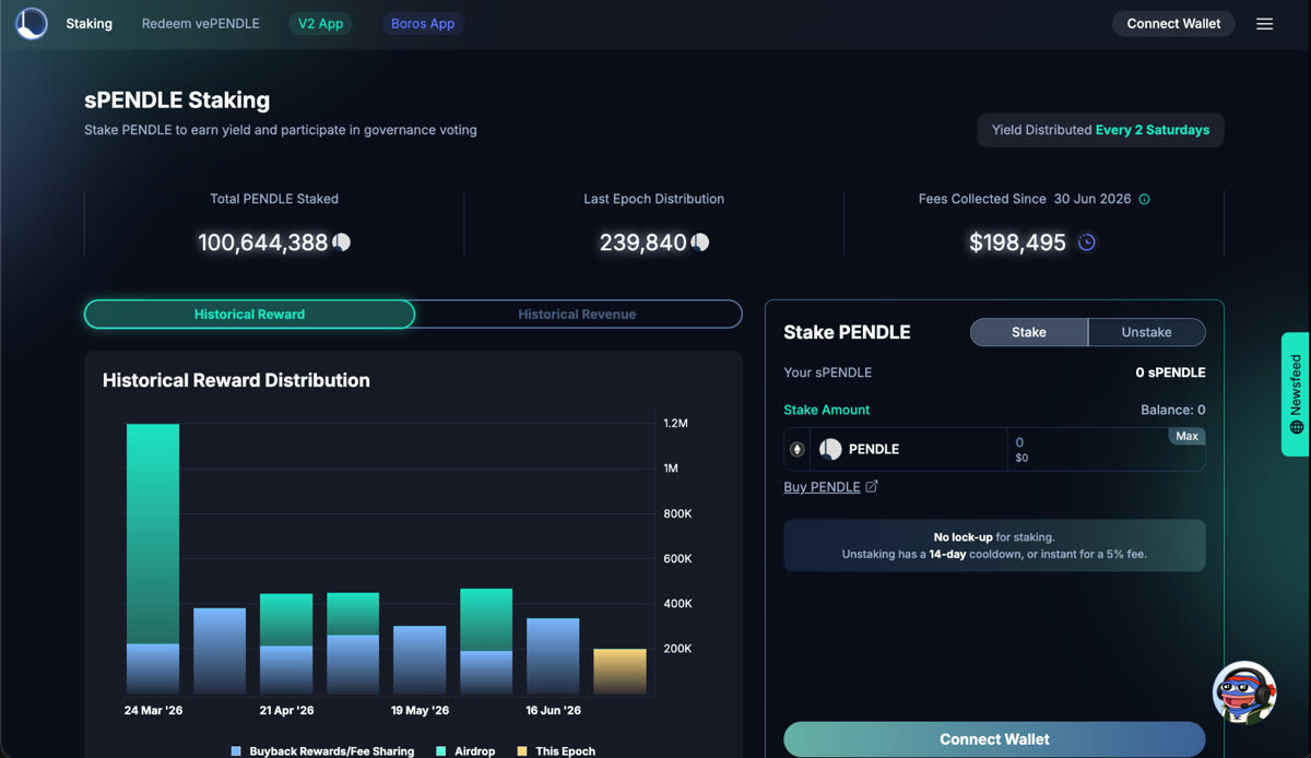
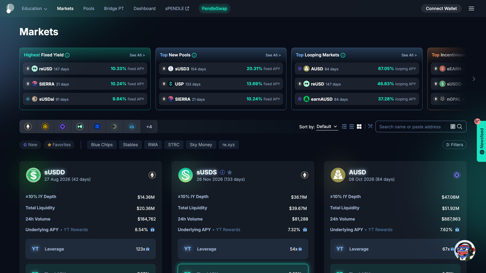
The markets view I designed for Pendle — fixed yield, new pools, and looping surfaced up front, then every market laid out with liquidity, volume, and APY so a user can compare before they commit.
Open the Pendle appWebsite & Marketing Design
Beyond the app, I designed and shipped the Pendle marketing site — the landing page that gives new users their first impression and gives partners and press their reference point.
The Pendle gateway — one front door routing two protocols, Pendle V2 and Boros.
Visit pendle.financeThe Pendle V2 page — the product story, from yield-trading thesis to live markets.
See the Pendle V2 pageThe same care extends to marketing: an illustration system for launches, partnerships, and campaigns — every piece drawn in one visual language, so each announcement compounds the brand instead of diluting it.
Visual & Brand System
I built Pendle’s brand identity as a system: a logo suite, typography, and a tokenized color palette that keep a high-stakes financial product precise, restrained, and confident on every surface it touches.
Codified and published as a public media kit, it’s the shared source of truth that internal teams, partners, and press all build from.
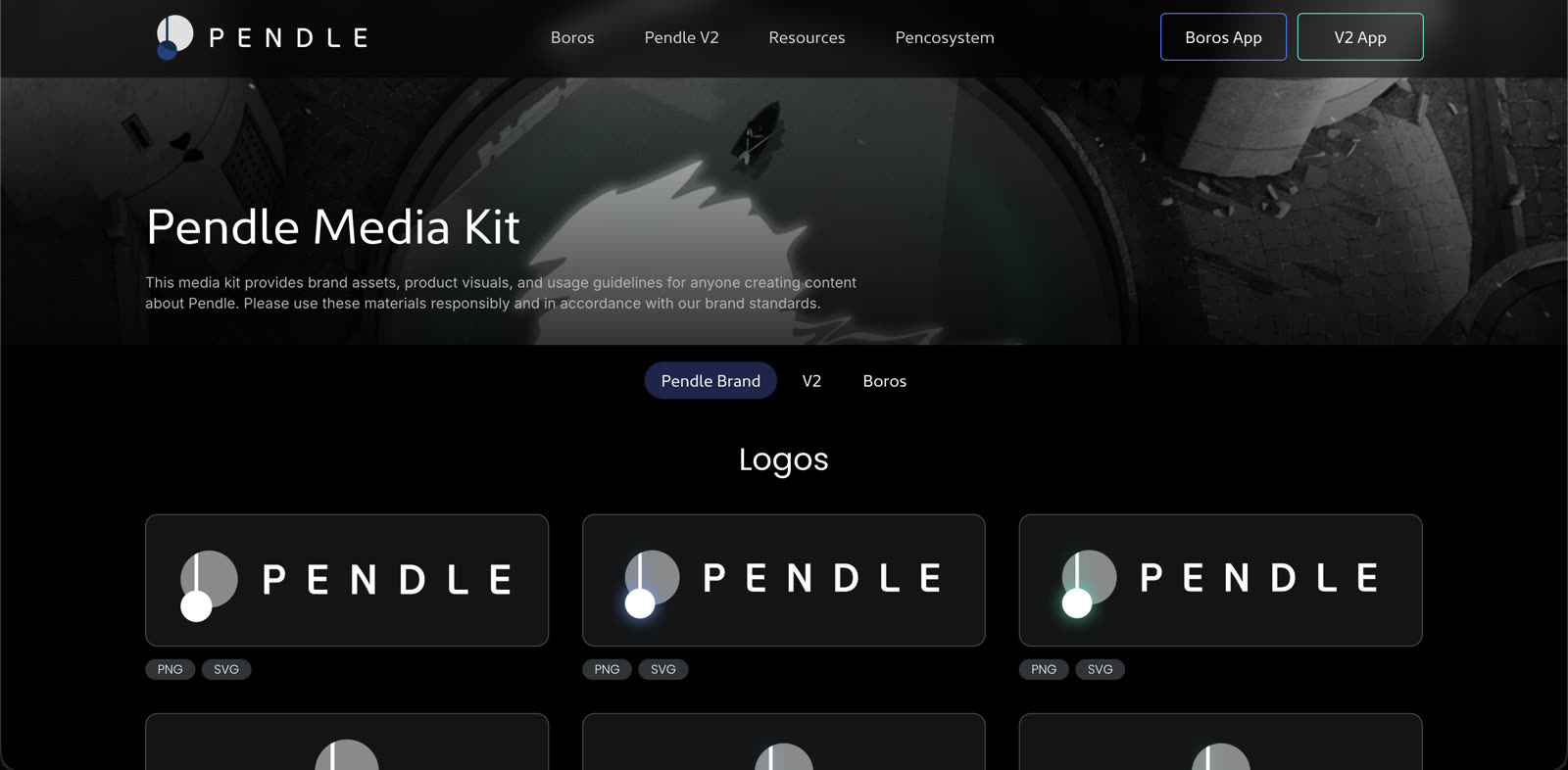
I built Pendle’s visual identity into a brand system — logo suite, typography, a tokenized color palette, and shared assets — published as a public media kit teams build on.
Open the brand guideTo keep that language alive beyond my own hands, I built Pendle Canvas — a design tool that turns the system into a library anyone on the team can compose with, on brand by default.
Pendle Canvas — a design tool I built on top of the system — a drag-and-drop library of on-brand vector assets with an AI composer, so anyone can build marketing visuals in Pendle’s visual language.
Open Pendle Canvas